
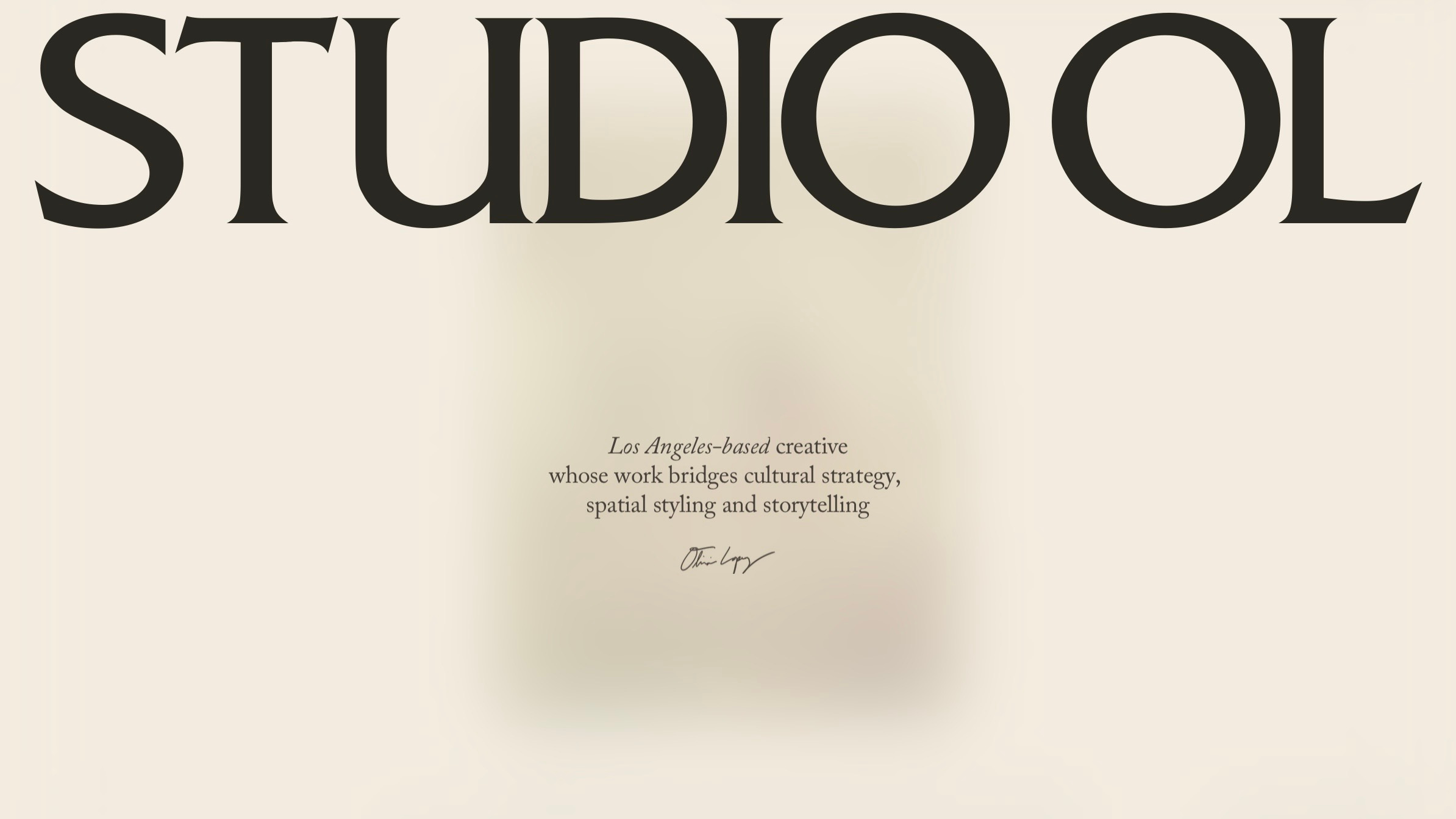
Behind the Screen: Meet OB Studio
A conversation behind the team who brought Studio OL to life

Behind Studio OL is OB Studio, the Paris and London-based design and technology studio founded by David Broner and Julie Daled. Their practice spans branding, art direction, UX/UI, and development—but at its core, is about giving form to ideas: translating something intangible into a digital presence that feels cohesive. When I brought them my brief for Studio OL—I wanted something that was a tactile portfolio with space to move through. The result is one of those rare collaborations where the final product feels exactly right, down to the smallest detail. Here’s our conversation about how it came together.
Can you introduce OB Studio—when it was founded, and the kind of work that defines your practice today?
David: Julie and I founded OB Studio in 2023. We’re a design and technology studio, mainly working for brands, companies, individuals who need to elevate their presence. Our typical clients can’t make any compromise on the quality of the way they present themselves and their products. We often boil it down to taste and credibility. If these two are key for you, that’s where we come in.
We’re rooted in digital design and technology, so creating high end digital platforms and products is what we excel at and do all year. It involves branding, art direction, UX and UI, motion, and development of all sorts.
What’s exciting is that we always end up in much broader areas, typically strategy, copywriting, merch, social content, physical installations. There’s no limit really. We’ve been around for 15 years+, done hundreds and hundreds of projects so we don’t feel so limited.
How did the two of you meet, and what led to the founding of OB Studio?
David: We met at my previous studio DVTK that Julie joined as a partner. When we closed that studio, Julie and I felt like starting from a fresh start would allow us to really manifest the vision we had back then, but which was difficult to execute in a pre-existing entity.
Julie and I are both passionate with the intrinseque quality of things. It can be art pieces, ceramics, photography, movies, products. We’re somehow similar in that way where we really respect premium products. And at the end of the day, our work is a lot about presenting something, and making sure that that thing gets the chance to be seen and shine the way it deserves.
Now to execute that mission means we need to take all aspects of how that thing is shown to the world, its presence or its aura let’s say, and work in such a way that nothing is left to chance. So in a way, we’re first and foremost working for the presence of our clients’ products, whatever that is. We actually chose a pointer for the logo of OB Studio as an affirmation that our work is always about what exists on the map, what’s IRL. We’re not interested in the purely virtual. We work for humans, for what they make, for what’s around them.
What were each of your backgrounds before starting OB Studio, and how did your individual experiences shape the studio’s direction?
David: I was trained as a 3D artist, but before that studied design since age 15 as in France we have the chance to have Applied Art studies that can start as early as highschool. So design has been something very concrete for me since adolescence. What led me to chose that path, although that wasn’t completely conscious back then, is that I had to change of environment at a young age from a place that I cherished, to a place that I found utterly ugly and sad. This was the most defining moment of my life. To this day, my number one obsession is to create a window of beauty in this world, to demonstrate that things can be beautified, things can be more functional, less clunky, less messy, less disembodied. Then I had to transform the attitude of working from a place of frustration, to working from a place of love and passion.
I feel like this influences a lot of what we do at OB because that obsession just completely integrates in the ethos of the studio, as in, we don’t let things go bad. We work for the beautification of the world, in the broadest sense of beauty, and in how beauty can have so many different faces: beauty can be ‘functional’, it can also be ‘calm’, but it has to be intentional.
Julie: My background is in business development. I’ve spent most of my career helping companies and brands grow into a new market, mostly businesses in fashion, luxury, tech, which took me to live in six countries.
My time in Japan and the US were probably the most formative. Japan, there’s a patience there, a willingness to build step by step and a different level of respect towards anyone you’re working with, that I found really compelling and that stayed with me. The US impacted me in a different way, how selling yourself and not shying away from commerce is so ingrained in the culture, the spirit of paying it forward, networking, just going for it without hesitation if you have a good idea. At OB Studio, we have a lot of fun working with US based clients for that reason; driven, pragmatic, fast.
What has always energised me most is working with a product, service or idea that’s exceptional and figuring out how to give it the platform it deserves. Earlier on, that was through business development, securing the right deals, clients, partnerships that could really move the needle. At OB Studio, we do that through a different angle: how do we showcase your work, your brand, your product in the most impactful way. We’re known for good design, but in the core, design awards is not what I care about personally but whether what we built had an impact on the client’s business. That’s where David and I align as well, we’re happy to challenge the brief or push a project in a direction we genuinely believe serves that.
Was there a defining moment when you realized you wanted to build something together?
David: It’s been an accumulation of zillions of tiny things, every day working together, facing challenges, supporting each other. It made it clear that—although we’re very different personality wise— we actually share a lot of values: integrity, transparency, pragmatism. We’re also very hard working people but who don’t have this toxic relationship (at least not anymore ^^) towards work where that should be the one and only thing that matters in life. Actually we’re very supportive to each other and really pushing ourselves to take days off, rest, try and log off sometimes.
Julie: As David mentioned, both of us, although we come from a different angle, we’ll show up fully for the outcome of each project to be its best. I’ve come to realise that what matters most in a business partner is trust, respect but also being equally driven and willing to do the work. We each take care of different parts of the work, but we both care about quality and building a healthy business, where the team is happy and proud to be a part of. For David and I, this means staying open to challenging ourselves on what we can do differently and better every day. With that approach, we’ve been able to see the impact of our efforts since we started 3 years ago. Im excited to see where we’ll be a year from now.
How do your personalities and strengths differ—and how does that dynamic influence the way you work as partners?
David: To name only a few examples, Julie is much more of a great diplomat than I am, although I have to say I got better and better thanks to her. In general, she’s excellent at finding the right balance between being the best support to our client while maintaining enough boundaries and structure, and ensure projects are never going off track. In general, calm and thoughtful, is how I would describe Julie best. This is so helpful for everyone in the team.
I feel like my biggest strength would be strategic thinking. I love to think about how to tackle key decisions from a strategic point of view. Pondering the pros and cons etc. We have many interesting conversations with Julie,every week. And perhaps how polyvalent I am creatively. In french we say ‘amateur of everything, specialist of nothing’. I can do motion design, interface, 3D, retouching, editing, sound design, writing, accountancy. I can jump on anything and help the team members when they need it. It also helps me to feedback in a way where I’m aware of how things are made. I came to realize that it’s actually rare for creative directors, and usually people I work with appreciate it.
Julie: We both started working at a young age and were both workaholics in the past which came from a passion for the work, I think that that accumulation of hours and the resourcefulness you build from taking responsibility from a young age and encountering numerous challenges turned us both into great generalist. On the creative side, I’m constantly impressed to see what a great creative generalist David is. What makes our projects strong is that they’re strong across all aspects - visual design, branding, motion, interaction, execution. David can jump into any of it alongside the team to get the best result possible for each project.
Your work spans fashion, luxury, and the arts—how would you describe your design philosophy across these sectors?
David: We don’t make distinctions between the sectors we work with. They cross pollinate so much nowadays, they all aspire to be one or the other.
Many of your projects feel both refined and highly narrative-driven. How do storytelling and brand identity influence the way you approach digital design?
David: Being children of the 90’s; I’m very much influenced by cinema. Watching movies was perhaps the main cultural thing as I grew up. This influenced the way I think about our digital project in two ways.
Firstly in how we imagine visitors’ interaction not only in terms of functions or interactions but also in terms of emotions and navigation. One example is how we like to tease visitors that land on a website, with an animation, typically just like the opening titles kind of build up at the start of the movie. Or how we always spread some easter eggs here and there, or micro animations. This is done to give visitors two levels of seeing. They can go fast and leave, or they can slow down and see new details. We reward curiosity.
Just like in movies, it’s all about the tacit contract that you have since the very beginning with the visitor. A digital platform has cues, a tone, textures, a type of layout, a way it moves and animates. This sets the expectation for the rest of the navigation, and the most important is to not disappoint these expectations as the visitors keep interacting. In a movie it’s exactly the same, and it’s been vastly theorized, there’s a contract between the movie and the spectator.
How has working in Paris and London shaped your perspective on taste, culture, and visual language?
David: Being based in Paris means we’ve been exposed to a certain type of aesthetic that everyone—and especially Americans— dream about. This is not true only to Paris of course, but Paris concentrate a lot of fantasms and gets a lot of love. We don’t feel a strong ownership of French or European culture or aesthetic BUT it is true that since we’re positioned as a design studio that creates highly aesthetic and curated designs, it does help a lot to be based here in terms of how legitimate we must feel to be in this space. And it also must be something somehow natural: just as natural in impulse food an American to be good in business. I’m personally more attached to the overlap between our cultures.
Julie: In Belgium, we grow up in a tri-lingual country, what I like is that it naturally develops an openness other cultures. In Brussels for example, when you want ask someone a question on the street, you first ask what language they speak and then you proceed accordingly. It’s a small habit, but it reflects that from a young age you grow up with the assumption that your own culture isn’t necessarily the default one, it instills some kind of openness.
I started working in fashion at a young age, and from there was exposed to and worked with great creatives, first in Belgium, then in other places like Paris, London, New York, Tokyo. I love living in London. Overall in cities like London and Paris, we’re spoiled with the exposure to culture, even just the number of great exhibitions at any given time. Over time, that exposure builts a sense of taste. I can see when something is not up to our quality standard, although as the creative, David can articulate very precisely why, and what it would take to get it there.
The visual language of each project is shaped by our team but influenced by the client, what they’re trying to achieve, the industry they operate in, their market, target audience, the positioning that makes sense for them. So what stays consistent across our work is the quality and the level of taste. The visual language itself differs from project to project, and that’s intentional, it’s the result of listening closely.


What signals or cues tell you that a brand is ready to invest in a meaningful digital presence?
David: There’s two scenarios: either someone high in the team is digital-savvy and has experience in building great digital presence. Or that person is not necessarily savvy, but has the vision, and is convinced that this is crucial to the business. Investing in a meaningful digital presence requires time investment and commitment to maintain that presence. This effort won’t be done if someone high in the companies is not strongly opinionated in favour to the importance of that digital presence.
Julie: The clearest signal is generally how they talk about it. When a brand sees their digital presence as business-critical - whether for positioning, lead generation, or how they present themselves - it comes through immediately. There’s a belief that leveling up their digital presence will have a real impact on the business. Without that conviction from the decision-makers, it’s hard to secure the right resources - whether that’s budget, time, or attention - to achieve something exceptional.
Before beginning a new project, what kinds of questions do you ask clients to understand their vision?
Julie: Key for us is understanding both the now and the future; what they want to achieve at launch, but also where they’re headed in a year or two. That longer view is what allows us to create something scalable that genuinely fits where the client is going, not just where they are.
We also dive into the core of the business: who they’re targeting, what their north star is, what success actually looks like for them. We’ll also ask what they like and what dislike which is often just as revealing.
Brief quality varies a lot. Some clients come with something clear and complete; with others we build the brief together. Either way, a good brief eliminates guesswork, reduces assumptions, and is a key part of a successful outcome. Briefing well is a skill, it takes time, but always pays back tenfold.


When we first began discussing the Studio OL site, I described it less as a portfolio and more as a “digital space.” How did it shape your approach?
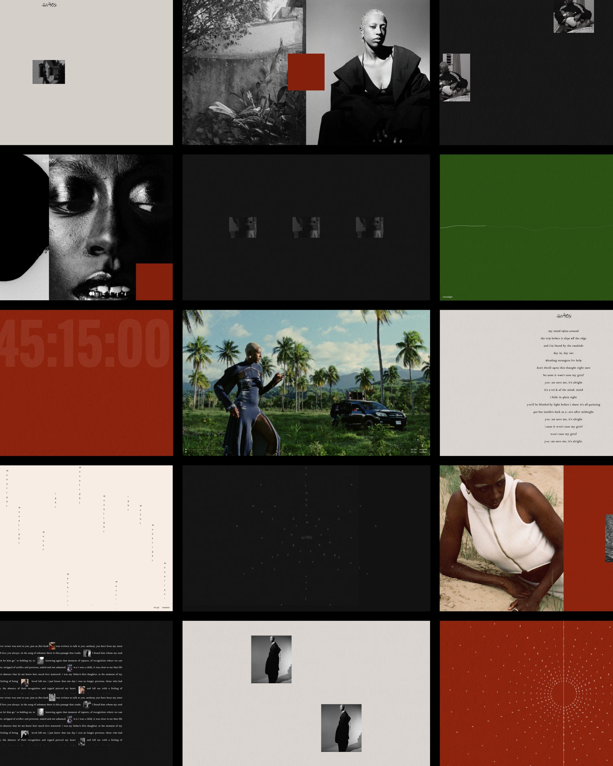
David: A portfolio typically strives for homogeneity and verticality. The goal is often to make sure the body of work is perceived as one and only spine. When you came to us with this idea of a space, it made us realized how one common denominator is so much of your work is your relationship with spaces and environments; and then to the stories built around them. This directly influenced the way we wanted the visitor to perceived your website: we imagined more of an exhibition space, which is why we quickly came up with the idea to turn the menu as a map of that space.
Then we pushed this further and thought that each section of the website will have to be a room, with its own scenography. So every room had to be different and really exhibit your work in a way that it’s unique, but also completely on point with the nature of the work. It had to be felt, before it’s explained, which is precisely how you work in a space, with visual cues.
The main thing we wanted to stay away from is to have that feeling of a website that solely delivers information, with classic pages etc. The map at the top stays there at all times, and allows visitors to explore your room one after the other without having the feeling to every leave your house.
The idea of “storytelling through space” was central to the brief. How do you translate something typically physical—like spatial storytelling—into a digital environment?
In digital design, we work with collective memories and minimal cues. Because 90% of our job is also to create something functional, we cannot just twist the whole thing and go too literal, trying to make a website that is literally looking like a space (say a virtual 3D space). I’m always reminded of this quote from Ayn Rand in the Fountainhead “what can be done with one substance must never be done with another. [...] Its integrity is to follow its own truth”. This is a core idea I follow every time we have to allude in digital design to something outside of that field.
So typically here we came up with this map menu I mentioned earlier, which subtly suggests something spatial to visitors. It’s giving ‘art gallery’, but doesn’t have to say it out loud. Another cue is the recurrent beige of the website which is alluding to the off-white color of most walls, which are never fully white. This cream color makes the whole experience feel very home-y, earthy, and physical.
A key priority for me was integrating writing and imagery as equal parts of the text in the experience. How did you approach balancing verbal and visual storytelling within the site’s structure?
That’s a really interesting point. The question we had was: how can we make sure language is not ‘just text blocks’. We wanted to avoid text-based content to be seen as fillers. That the presence of language is just as embodied as photographs.
One example of how we tackled that was the use of handwritten text, which is something we incorporated already within the visual identity. We used your signature, and proposed to display handwritten notes in some of your pages. Then we stayed away from any icons, and instead worked carefully with you on the copywriting of each section. In the age of AI and LLMs, carefully curated language becomes such a big differentiator.
How do you think about interaction design when the goal isn’t efficiency, but atmosphere?
My favourite topic. In 2018, as I was working on the website for a concept store made by Galerie Lafayette in Paris, I had some kind of epiphany and came up with a ‘motto’ which was ‘positive friction’. To make it short, the idea is to resist the urge of applying frictionless design to every single digital project. Removing friction points is one of the greatest design method when it comes to technology adoption, to mobile apps, any products that focus on pure function. To be fair, 90% of the time it’s totally justified and needed. But when it comes to experience design, or simply brand presence, applying these principles always results in removing all the unique aspect of your brands, makes everything looks equal, numbs visitors and prevents them from getting a memorable experience.
This was almost 10 years ago and it was difficult back then to get people onboard with this idea but today things completely shifted. I can see the word friction popping up everywhere and a lot of strategists, designers are claiming that friction is almost the ONE tool that brands can and should use today to connect with their audience, because what people miss today is opportunities of feeling ‘present’. And there’s no sense of presence in a frictionless world. I often say: after a decade of accessibility, we’re entering the decade of presence.
To answer your question in a more direct way: there’s always a layer of efficiency in all of our projects. Efficiency is the bare minimum. The goal is to make sure efficiency is not the subject. It’s like ecological brands. Successful ‘ecological’ brands understand that they shouldn’t make the ecological aspect their central positioning. This is an ethos that people get to feel, to perceive. Same goes with efficiency, it’s our responsibility towards visitors that a platform delivers content and information efficiently. This is the base layer that allows us to never talk about it again, so that we can focus on the atmospheric aspect of the experience.
Then working on the atmosphere of an experience is the result of curation. Curating colors, typefaces, content, animation, making sure all points out to the same sensations and emotions. In the case of Studio OL, words that come to mind are: depth, spatial, timeless, earth, imprinted. At any moment, looking at what we produce, we ask ourselves if the frequencies are within or outside these notions.
The color palette was very grounded in materiality—how did you translate something tactile and interior-driven into a digital palette?
Studio OL’s palette was a tight collaboration with Olivia, whose palette is very well defined and grounded. Our main question was, what should be accents, and what should be dominant. We choose the light beige color as the background shade for the website to give visitors an immediate sense of ‘home’, suggesting the off-white colors of walls, when lit with a subtly warm interior diffuse lighting.
Also, none of the colors are extremes, there’s no pure white, pure black. All shades are off-tones, which again ties the visual identity back to physicality, because extreme colors don’t exist in the physical world.
Typography played an important role in referencing both editorial and design worlds. How did you approach type as part of the storytelling—not just readability?
This is linked to the idea of making language equal to visuals within your visual identity, as well as in the website experience. Here it was a push and pull between creating enough contrast and variations of styles within the different typographic moments, to give depth and stir the visual energies, while making sure we don’t end up with anything messy, with too many font sizes and styles. To go back to the topic of efficiency, it’s important to stress the importance of a design system, to make people’s life easier, strive for clarity, not getting them lost in a myriad of heterogeneous symbols.
If you’re navigating through the website, you will quickly get the sense that you’re navigating a space that’s non fully digital but draw inspiration from printed matters. This is due to the use of indented text, annotations, handwritten notes, change of paragraph width, and most importantly a use of white space that’s suggesting printed layouts more than digital interfaces. All of these are cues of the world Studio OL lives in.
The site needed to hold multiple bodies of work—writing, interiors, photography, podcasting—without feeling fragmented. How did you approach creating cohesion across these different mediums?
What would have made the different work fragmented is to have different sections that looks visually similar, but displaying completely different content. Then, this would make the difference of content stand out, and visitors would have to piece together what is what, what goes where, and the navigation between the different type of content would be much blurrier.
Instead we decided to give each type of content its own room, with completely bespoke design, while maintaining an unity at the moment of transition between one room to the other: the menu. The menu, which looks like a gallery map, is the bridge between the different room. It creates a visual link that makes visitors feel like all spaces are seamlessly connected together, despite their differences.
There’s a strong emphasis on restraint throughout the site—knowing what to include and what to leave out. How do you make those decisions when working with a visually rich body of work?
I always say you need to show less for people to feel more. Cinema is entirely based on this, what’s off camera is what captivates people. We’re attracted by what we don’t see, we desire what we don’t have. Our brain is a machine for filling gaps. Same goes with a body of work, you need to show just enough for people to get a sense of and let the imagination do the rest. That’s probably a number one rule in design, especially in digital where most people see a website as a dump, or are so afraid that people get to see everything that they can do. But it’s quite the opposite, it’s like when people justify themselves through 3-4 different reasons. Just give one excuse and stick to that. Curation curation curation.
Looking at the final result, what do you feel is the most successful aspect of the site—and what detail might go unnoticed, but was important to get right?
David: The most successful is the harmony between the different section, how they speak to each other while maintaining their own personality and role. This was a challenge, and I’m very happy with how it came out.
Option 1: A detail that might go unnoticed is that if you rick click on the website on desktop and click on Inspect, it opens the code console and shows From OB Studio With Love.
Option 2: A detail that might go unnoticed is the footer. We worked on it as a printed poster. When you reach the bottom of the pge, the top navigation leaves and gets swapped by a bottom navigation. The map menu is replaced by a chapter navigation at the bottom right hand corner. I love this moment of the website, calm and soothing.
Julie: My favourite aspect of the website is the menu, it’s unique without being gimmicky and very much brand for Studio OL. From the moment you land, it immediately highlights the multi-disciplinary approach.
The menu then naturally guides you into each section, which all feel distinct but part of the same universe. The interiors page, for example, is purely visual, while the creative direction page takes a more editorial approach, combining text, imagery, and annotations.
A huge thank you to David and Julie for this conversation. For more from the design duo behind this build, you can find David and Julie at OB Studio and on Instagram.